
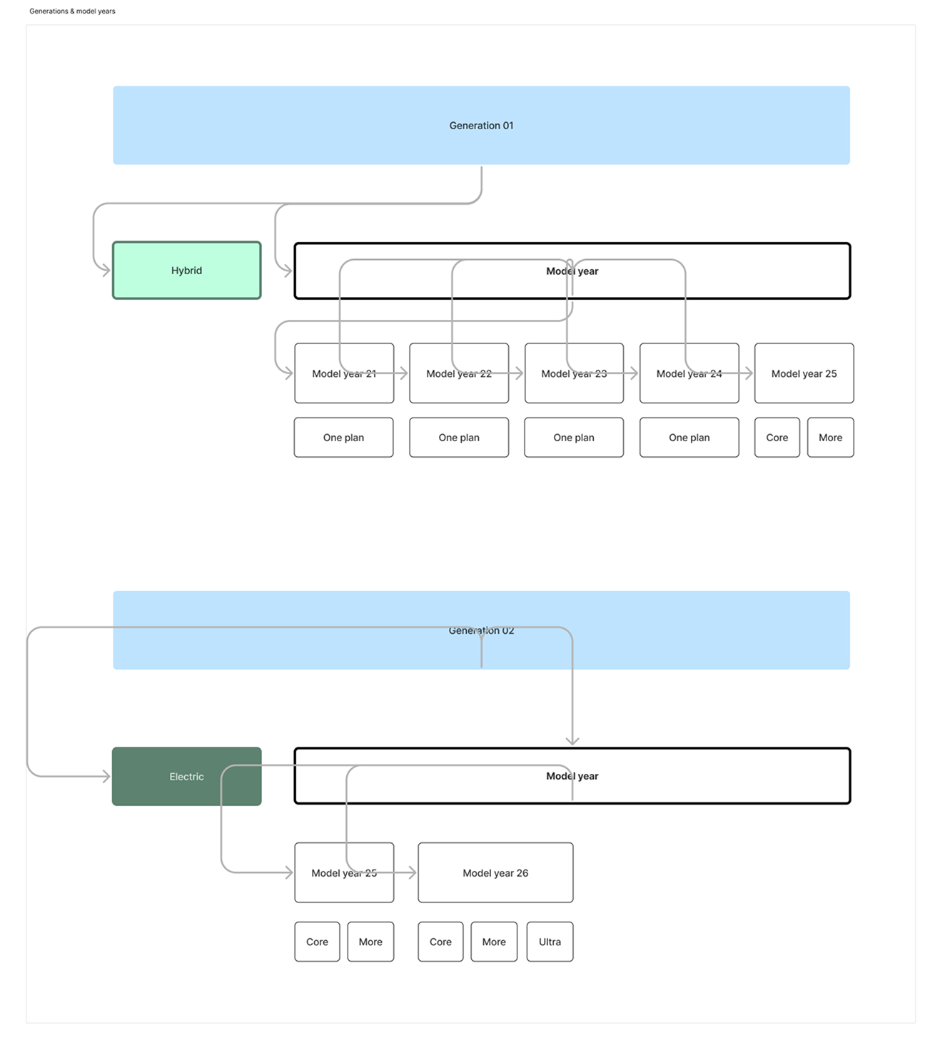
At Lynk & Co, there has historically been only one car model. Each year, a new model year introduced small updates (for example, a heated steering wheel).
With the launch of Lynk & Co 02 and generation 08, there will be multiple car models, each evolving across different model years.
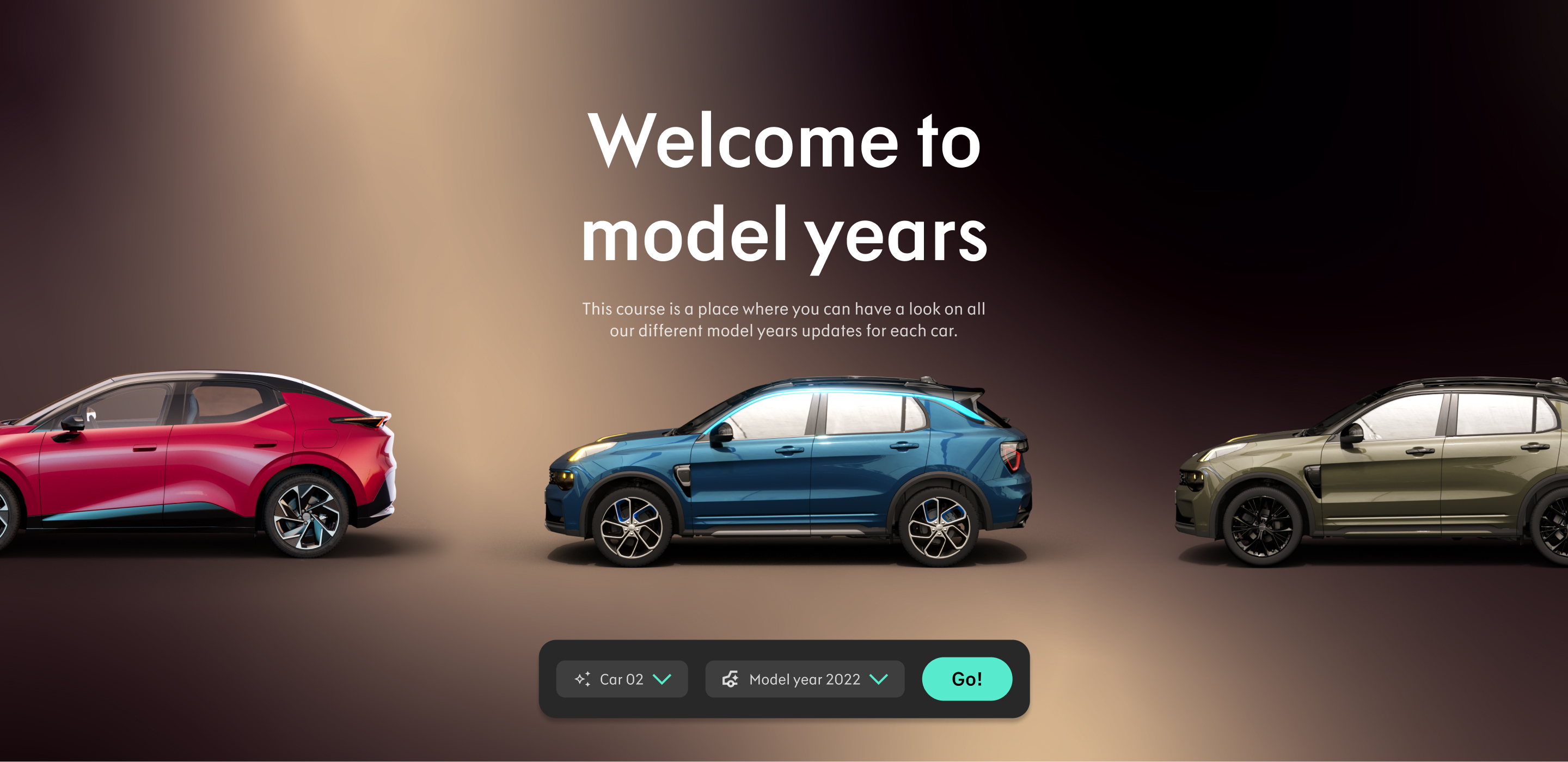
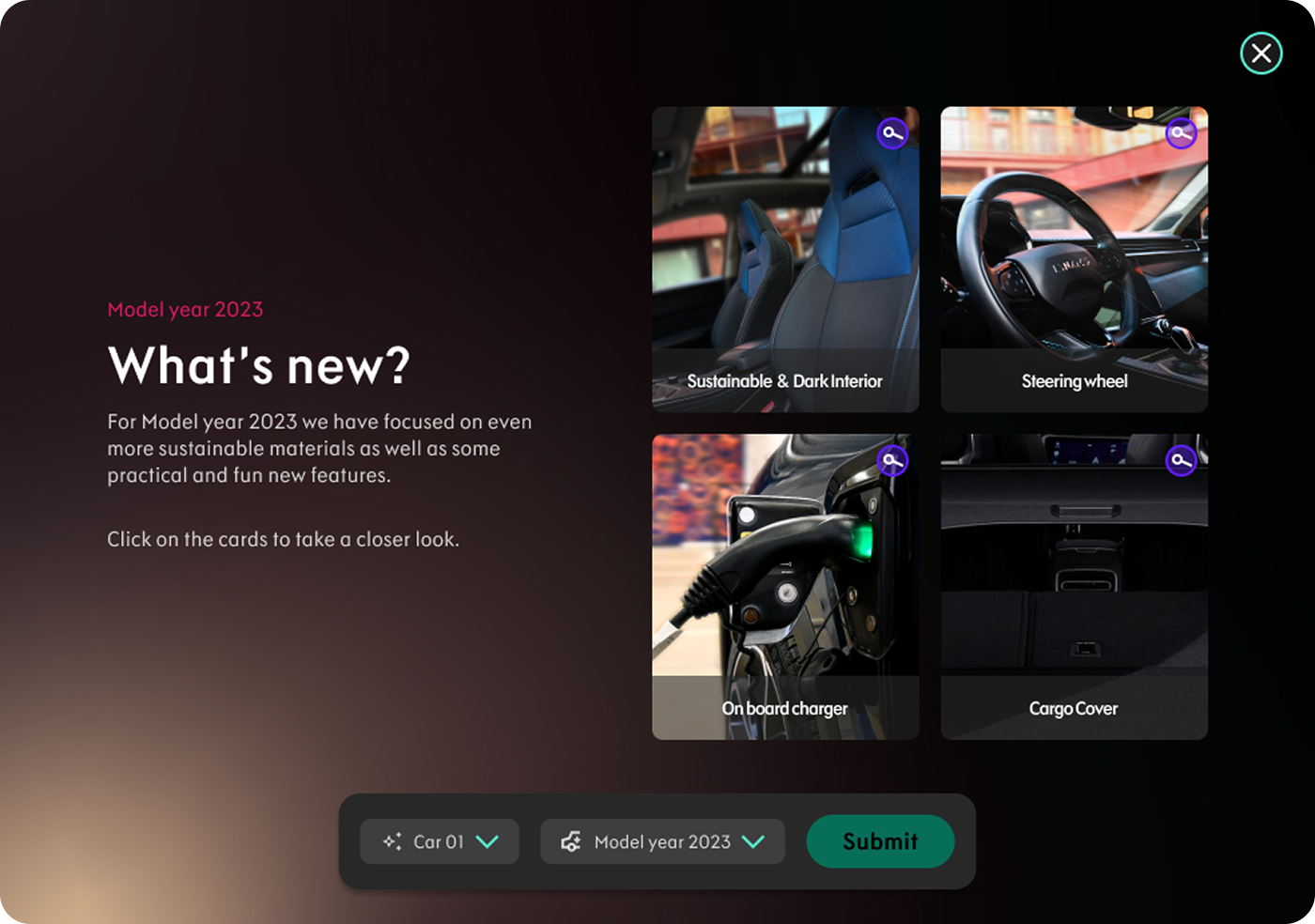
After some brainstorming around both UX and visual design, we developed a solution featuring a floating navigation bar that allows users to easily navigate between different cars and model years — both at the start of the course and within the course itself — to seamlessly switch model years and compare features.
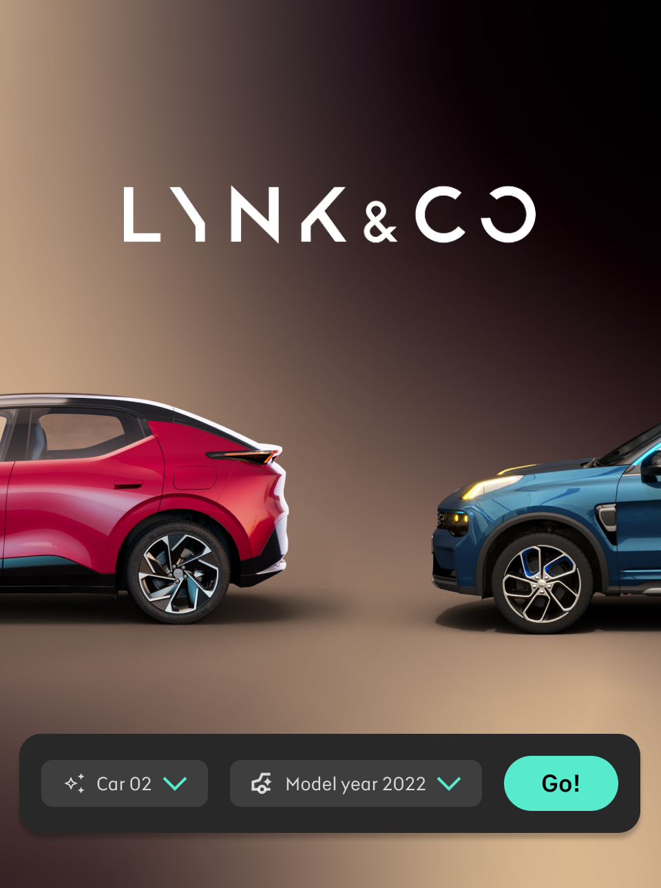
Since model years are not directly tied to the courses in Lynk & Co’s technical training catalog, we decided to adjust the visual theme.
Instead of using the usual dark blue background, we introduced a warmer brown gradient to bring out a sense of creativity and playfulness.
To complement this update, I also organized an outdoor photoshoot with the Lynk & Co 01 to refresh the course imagery and better align with the new visual direction.
UX & brand Designer
Me and my manager
Figma, Photoshop, system camera, After Effects
Oct 2024-Mar 2025

One of the main reasons we designed a smart navigation system is that, as more cars and model years with various updates are added, the complexity of the course grows quickly. Managing a single car with multiple model years is straightforward, but introducing several cars significantly increases the number of variations.
To address this, we implemented a floating navigation bar that allows users to easily switch between cars and model years — both at the start of the course and within it — making it simple to explore and compare different options without losing context.
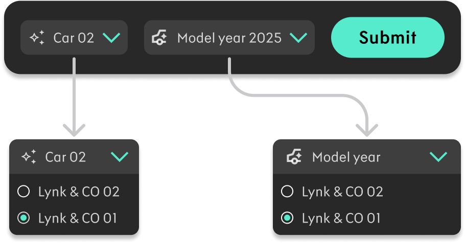
The navigation in Model Years features a floating navigation bar where you can easily select the car and model year you want to view.
The smart thing about this setup is that you can change both the model year and car directly within the course — without exiting and restarting it — making it simple to compare different solutions side by side.
With updated images and a refreshed branding theme, we introduced a solution that allows you to easily slide through the available options.

Essentially the same concept, but with a new layout designed to make the experience feel more dynamic and alive.
My key takeaway from this project is the importance of trust and having the freedom to explore creativity. We invested a lot of time brainstorming around the visual concept and experimenting to find the right outcome.
It truly felt like a luxury to have the opportunity to explore several concepts and craft a carefully curated experience.


